 PELORA LABS®
A Calmer, More Credible Clinic, Online
AcuPoints Clinic
AcuPoints Clinic delivers calm, considered care in person. Its website needed to do the same job online — reassure new patients, explain treatments clearly, and make booking effortless. Pelora Labs designed and built a website that reflects the practice and turns quiet interest into booked appointments.
- Industry
- Healthcare — Acupuncture & Wellness
- Client
- AcuPoints Clinic
- Project type
- Website design & build
- Services
- UX Strategy · UI Design · Web Development · SEO
- Pelora Labs' role
- Product & design partner
- Technology
- Next.js · React · TypeScript · Tailwind CSS
- Location
- Auckland, New Zealand
- Live site
- acupointsclinic.com
- AcuPoints Clinic is a boutique acupuncture and wellness practice whose website didn't match the calm, trustworthy experience of the clinic itself.
- Pelora Labs led UX strategy, UI design, development and SEO — rebuilding the site around how patients actually decide to book.
- The result is a calm, credible, fast website with clear treatment pages and a simpler path to appointment.
- Built on a modern, maintainable stack that's ready for future automation and AI without a rebuild.
Executive summary
AcuPoints Clinic offers acupuncture and wellness treatment built on genuine care and clinical attention. In person, that care is obvious. Online, it wasn't coming through — the existing website looked dated next to the standard of the practice, treatment information was hard to navigate, and the journey from “interested” to “booked” carried more friction than it should. For a boutique healthcare provider that grows largely through trust and word of mouth, an underwhelming website is a quiet but constant leak of enquiries.
The strategic opportunity was straightforward to name and harder to execute well: make the website feel as reassuring and professional as the clinic, and make booking the path of least resistance. Pelora Labs partnered with the clinic as its product and design team — leading discovery, information architecture, UX and UI design, front-end development and on-page SEO as one connected engagement rather than a series of hand-offs.
The outcome is a calm, modern website with clearly structured treatment pages, fast and accessible mobile-first layouts, and a streamlined route to booking that connects to the clinic's existing appointment process. Just as importantly, it's built on a foundation the clinic can grow with — a maintainable codebase and structured content that can support future automation and AI features without another rebuild.
About the project
AcuPoints Clinic sits in a part of healthcare where the buying decision is deeply personal. People arrive with a specific problem — pain, stress, recovery, fertility support, general wellbeing — and often a degree of uncertainty about whether acupuncture is right for them. The website's job isn't to sell aggressively. It's to inform, reassure, and remove the small obstacles that stop a considered person from taking the next step.
That context shaped everything. Boutique healthcare is a relationship business: patients choose a practitioner they trust, and they return because the experience is consistent. Increasingly, a new patient's journey starts on a phone — a search, a scan of the treatments, a quick judgement about whether the practice feels credible — long before they ever walk through the door. If the website feels careless, the impression carries over, fairly or not.
There's a broader market trend at work too. Patients now expect the same standard of digital experience from a local clinic that they get from national healthcare brands and consumer apps: fast pages, clear information, and booking that takes seconds. Meeting that expectation is no longer a differentiator — it's the cost of being taken seriously.
Where the experience was leaking
We framed the challenge in business terms, not cosmetic ones. The clinic didn't need “a nicer website” — it needed the website to convert genuine interest into booked appointments while protecting the credibility of the practice.
The look and feel didn't reflect the calm, professional experience of the clinic — creating a credibility gap before a patient had read a single word.
Treatment information was difficult to find and scan, so the questions patients ask most often went unanswered at the moment they mattered.
Getting from an interested visit to an actual appointment took more steps and more thought than it needed to, especially on mobile.
Without clear, well-structured content and on-page SEO, the site wasn't working hard enough to be found by people searching for exactly what the clinic offers.
Performance and layout hadn't kept pace with modern expectations — and slow, awkward pages quietly cost enquiries, particularly on phones.
The previous setup made even small changes awkward, and left no clear path to add automation or smarter features later.
Understanding the decision to book
Before touching the interface, we invested in understanding the practice, its patients and the decision they're making — mapping the real journey from first search to booked appointment.
Business & practitioner discovery
We aligned on the treatments, the ideal patients, and the commercial goal of the site — turning quality care into booked appointments.
Patient journey mapping
We mapped how a new patient moves from a symptom or search to a decision, and where hesitation or friction breaks that path.
Content & UX audit
We assessed the existing content and structure against the questions patients actually ask before committing to treatment.
Priorities & architecture
We defined the page structure and priority order so the most important reassurance and the booking action are never more than a step away.
Strategy
The strategy rested on a simple principle: reduce the effort and the doubt between a patient's interest and their booking. Every decision was measured against that. If a design choice made the practice feel more credible, or made booking easier, it earned its place. If it was decoration, it didn't.
Customer experience first
We treated this as a customer experience problem, not a marketing one. That meant leading with clarity — plain-language treatment explanations, an honest sense of what to expect, and a design language that signals calm and professionalism. Reassurance is the product here, and the experience needed to deliver it consistently from the first tap.
A focused, high-quality scope
Rather than an everything-at-once rebuild, we prioritised the pages and moments that drive booked appointments: the treatments, the reasons to trust the practice, and the booking path itself. A tighter, well-executed scope produces a better result than a sprawling one delivered thinly — and it gets the value live sooner.
Built for what comes next
We also made deliberate architectural choices so the site could evolve. Structured content and a clean, component-based build mean the clinic can extend the experience later — new treatments, richer content, automation and AI assistance — without starting again.
A website that reflects the practice
An information architecture organised around patient questions and the booking decision — so the site guides rather than just displays.
A considered visual language — restrained colour, generous space and clear typography — that signals professionalism and puts the content first.
Each treatment explained in plain language: what it helps with, what to expect and why it's worth booking — answering hesitation head-on.
A short, obvious route to appointment that connects to the clinic's existing booking process and stays visible on every device.
Lightweight, fast-loading responsive layouts, because most patients arrive on a phone and slow pages quietly lose enquiries.
Semantic structure, readable type and sensible contrast, so the site works well for older patients and a wide range of needs.
Well-structured content and metadata that make the clinic easier to find for people searching for exactly what it offers.
A clean codebase and structured content that make updates easy and keep the door open to future features.
AI & future readiness
This engagement didn't call for AI on day one — and part of good product thinking is knowing when not to add complexity. What it did call for was an architecture that won't stand in the way when the clinic is ready for more.
Because the site uses a modern, component-based framework with structured content, several capabilities become straightforward to add later rather than requiring a rebuild. An AI assistant could answer common patient questions — “does acupuncture hurt?”, “what should I expect in my first session?” — drawing on the clinic's own approved content, so answers stay accurate and on-brand. Automated appointment reminders and follow-ups could reduce no-shows and administrative load. Lightweight personalisation could surface the most relevant treatments based on what a visitor came to read.
The point isn't to promise features the clinic doesn't need yet. It's that the decisions made now keep those options open and inexpensive to pursue — which is exactly what future readiness should mean.
Chosen for speed and trust
We only use technology that earns its place. For a healthcare clinic that depends on speed, trust and discoverability, the stack was chosen to deliver strong performance and SEO out of the box, while staying maintainable and ready to grow.
Stack
- Next.js — fast, SEO-friendly rendering and a solid performance foundation
- React — a component-based UI that's straightforward to extend
- TypeScript — type safety that keeps the codebase reliable long term
- Tailwind CSS — a disciplined styling system and lightweight pages
Services delivered
- Product Strategy
- UX Research
- UX Design
- UI Design
- Web Development
- UX Writing
- Technical SEO
- Accessibility
What changed
We describe outcomes in the language of the experience rather than inventing figures. The clinic now has a website that reflects the quality of its care, answers the questions that stall a booking, and makes the next step obvious on any device. For a practice that grows through trust, that's the change that matters: fewer interested visitors slipping away, and a stronger, more professional presence working for the clinic every day.
Google Analytics, 28 days
The digital strategy delivered measurable growth — combining UX/UI design, website development, SEO, analytics and digital marketing to build visibility and drive sustained user growth.
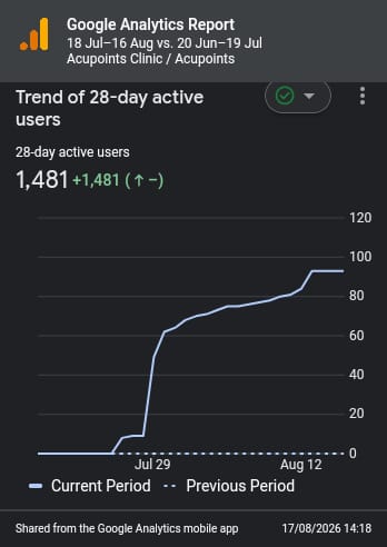
Activity increased sharply from late July and continued trending upward throughout the period.
4 leads generated in the period.
What the site does
Clear explanations of each treatment and what to expect. Patient benefit: less uncertainty before booking. Business value: interest converts instead of drifting away.
A short, always-visible route to appointment. Patient benefit: they can act in the moment. Business value: more booked appointments from the same traffic.
Lightweight layouts tuned for phones. Patient benefit: an effortless experience wherever they are. Business value: fewer lost visits from slow or awkward pages.
Semantic structure and strong contrast. Patient benefit: usable for older and less confident visitors. Business value: a wider, more inclusive reach.
Well-structured pages and metadata. Patient benefit: they find the clinic when they search. Business value: sustainable, compounding discoverability.
A clean, extensible build. Patient benefit: the experience keeps improving. Business value: new features without a costly rebuild.
Business impact
The commercial case for this work is compounding rather than one-off. A clearer, more credible website improves the return on every other channel the clinic uses — a referral, a social post or a search all land somewhere that now does its job. By reducing the friction and doubt around booking, the site helps convert more of the interest the practice already earns, which is the most efficient growth there is.
Operationally, a maintainable build lowers the cost and effort of keeping the site current, and the door is open to automation that could reduce administrative load and no-shows over time. Strategically, the clinic has moved up a level in digital maturity: from a website that quietly held it back to a platform that reflects its standards and can grow with it.
Lessons learned
The most valuable insight was one worth repeating on every healthcare project: in a trust-led business, clarity converts better than cleverness. The wins didn't come from visual novelty — they came from answering the patient's real questions, in the right order, with a design that got out of the way. Restraint was a feature.
We were also reminded that scope discipline is a form of respect — for the budget and for the outcome. And designing for future readiness from the start costs very little at build time but saves a great deal later; the cheapest time to keep your options open is before the first line of production code.
Future opportunities
A private assistant that answers common questions from the clinic's approved content — accurate, on-brand and available around the clock.
Appointment reminders and follow-ups that reduce no-shows and free up administrative time.
A library of treatment guides and wellbeing content that builds trust and improves search visibility over time.
Surfacing the most relevant treatments and next steps based on what a visitor came to read.
A tighter, in-page booking experience as demand and scheduling needs grow.
Clear reporting on how patients move from visit to booking, so future changes are guided by evidence.
Frequently asked
What did Pelora Labs do for AcuPoints Clinic?
What industry does this case study cover?
What was the main business challenge?
How did Pelora Labs approach discovery?
What does the new website include?
How does the website help turn visitors into patients?
Is the website accessible and mobile-friendly?
What technology is the website built on?
Is the platform ready for future AI or automation features?
How do I start a similar project with Pelora Labs?
Want work like this?
Book a discovery session. We'll talk through your business, the people you serve and the outcomes you're aiming for, then recommend a focused plan.